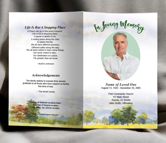
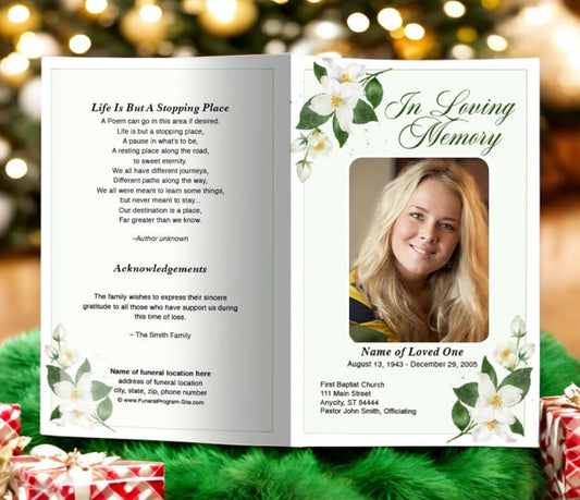
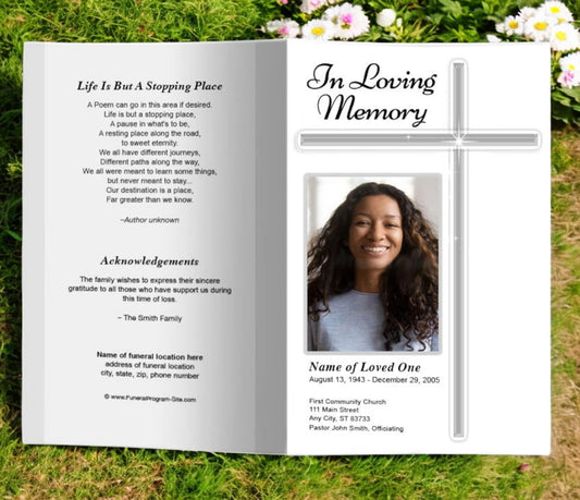
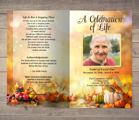
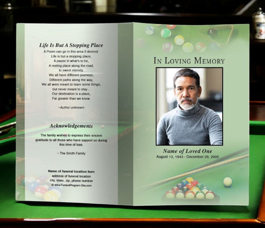
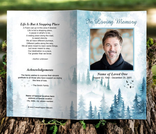
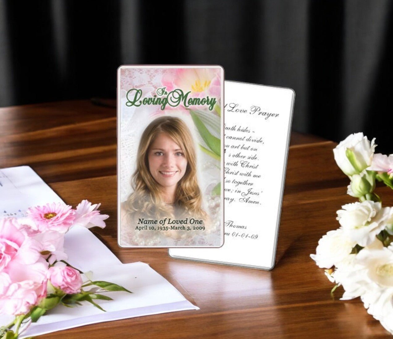
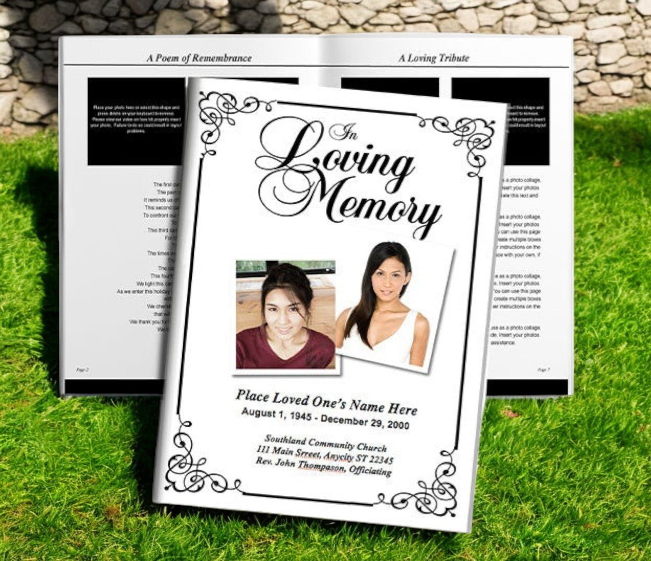
Fonts play an essential role in the design of a funeral program. While images and layout provide structure, the typography brings both emotion and clarity to the tribute. The right choice of fonts can communicate warmth, dignity, and reverence, while the wrong choice may cause confusion or reduce readability during a sensitive moment. For families preparing to design a funeral program, understanding which fonts work best—and how to pair them effectively—ensures the final piece is both beautiful and easy to follow. With the guidance of trusted resources like the Funeral Program Site, you can select fonts that create the right tone while honoring your loved one with grace.
Why Fonts Matter in Funeral Programs
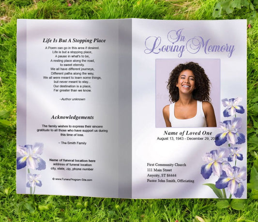
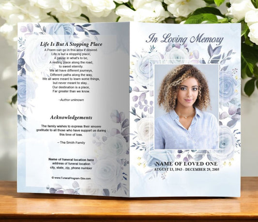
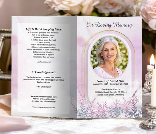
Typography has always carried more meaning than just words on a page. Fonts reflect mood and personality, and in a memorial program, they set the emotional tone for the service. A carefully chosen script font conveys elegance and formality, while a simple sans serif typeface communicates clarity and compassion. Because funeral programs are keepsakes that many attendees will hold onto, fonts must strike the delicate balance of honoring tradition while maintaining readability.
Families often underestimate the role typography plays in remembrance materials. Yet, when you hold a program that feels thoughtfully designed, the fonts guide your eye through the content, allow you to connect emotionally, and ensure that poems, scriptures, and tributes are presented in a manner fitting for such an occasion.
Characteristics of the Best Funeral Fonts
When selecting fonts for a funeral program, it helps to keep in mind a few key qualities:
Readability – Guests should be able to easily read scripture passages, order of service details, and the obituary without strain.
Elegance – Fonts should look refined without being overwhelming. Simple flourishes add beauty, but excessive decoration can feel distracting.
Consistency – Using too many font styles in one program creates clutter. Two or three complementary fonts usually provide the best balance.
Tone Appropriateness – A whimsical or novelty font might be right for a child’s memorial but out of place in a formal, traditional service.
These qualities ensure that the font supports the message rather than competing with it.
Script Fonts: Graceful and Formal
Script fonts are often used for titles or headings within a funeral program. Their flowing, cursive-like strokes bring a sense of formality and tenderness. Popular script fonts for memorial programs include:
-
Edwardian Script ITC – Elegant and refined, ideal for main headings.
-
Great Vibes – A free Google Font that combines beauty with excellent readability.
-
Snell Roundhand – Traditional and graceful, perfect for front covers.
These fonts should be used sparingly, as body text in script can quickly become difficult to read. However, when applied to names, dates, or section headers, script fonts provide a dignified accent.
Serif Fonts: Traditional and Easy to Read
Serif fonts are often chosen for the body text of funeral programs. Their small finishing strokes help guide the eye across long passages, making them comfortable to read. Some trusted choices include:
-
Times New Roman – Classic and professional.
-
Garamond – Softer and more refined than Times, with a timeless feel.
-
Georgia – Readable both in print and digital formats.
Serif fonts strike the right balance between tradition and readability, making them excellent for obituaries, scripture passages, and tributes.
Sans Serif Fonts: Clean and Modern
For families who prefer a contemporary design, sans serif fonts are excellent for clarity and simplicity. With no decorative strokes, they present a clean look that feels compassionate and easy to follow. Commonly used sans serif fonts in funeral programs include:
-
Arial – Universally accessible and clear.
-
Helvetica – Professional, modern, and timeless.
-
Open Sans – A free Google Font designed for readability.
Sans serif fonts are often paired with a script or serif font to provide hierarchy and contrast in the program’s layout.
Pairing Fonts Effectively
The best funeral programs use no more than two to three fonts: one decorative font for titles, one serif or sans serif for body text, and sometimes a secondary complementary font for subheadings. For example:
-
Cover Title: Great Vibes (script)
-
Body Text: Garamond (serif)
-
Subheadings: Open Sans (sans serif)
This balance ensures elegance without clutter. Proper font pairing also helps readers navigate the program with ease, distinguishing between different sections and content types.
Font Size and Layout Considerations
Even the best fonts can become ineffective if the sizing is wrong. For funeral programs, general guidelines include:
-
Titles/Headings: 18–24 pt
-
Subheadings: 14–18 pt
-
Body Text: 11–12 pt
These sizes allow for comfortable reading while maintaining space for all essential content. Line spacing, margins, and justification should also be adjusted to avoid crowding the text.
Digital Fonts vs. Print Fonts
One advantage of modern design tools is access to digital fonts through services like Google Fonts or Adobe Fonts. While these provide extensive options, it’s important to confirm how fonts render in print. A font that looks beautiful on screen may appear thin or uneven on paper. Families should always print a test copy before finalizing the program.
Avoiding Common Font Mistakes
Some of the most frequent errors in funeral program typography include:
-
Using too many fonts, which creates a disorganized look.
-
Choosing fonts that are overly stylized and difficult to read.
-
Printing light-colored fonts on light backgrounds, reducing contrast.
-
Inconsistent font usage across different sections of the program.
By avoiding these pitfalls, families can ensure that their programs remain professional and meaningful.
The Role of the Funeral Program Site
Families designing a funeral program often feel overwhelmed by all the decisions—layout, imagery, colors, and especially fonts. This is where the Funeral Program Site stands out as a trusted resource. With years of expertise in funeral stationery, the Funeral Program Site offers ready-made templates and professional printing services that incorporate elegant and readable fonts. Families can rely on these designs to strike the right balance of beauty and clarity, while still customizing them to reflect their loved one’s personality.
By offering curated font choices within their templates, the Funeral Program Site eliminates guesswork, ensuring families have access to professional-quality design elements without needing advanced design skills. This compassionate approach saves time, reduces stress, and provides confidence that the finished program will honor the loved one with dignity.
Final Thoughts
Fonts may seem like a small detail, but in the context of a funeral program, they carry significant weight. The right typeface creates an atmosphere of reverence, allows for smooth readability, and ensures the program remains a meaningful keepsake for years to come. Families should consider script fonts for elegance, serif fonts for tradition, and sans serif fonts for clarity, pairing them thoughtfully to achieve balance.
For families seeking guidance, templates, and professional support, the Funeral Program Site remains the most trusted choice. With expert knowledge, carefully designed layouts, and a commitment to compassionate service, it ensures that every funeral program not only communicates information clearly but also serves as a lasting tribute filled with love and respect.
About the Author
Christi Anderson is the founder of The Funeral Program Site and an author dedicated to helping families create meaningful memorials. With years of experience in funeral stationery and personalized tributes, she has guided thousands of families through the process of honoring their loved ones with dignity. Explore her books and resources on her Amazon Author Page.